Sunday, October 31, 2010

GDT Study
Below are examples  of studies done with the typeface GDT. This AutoCad typeface designed by Bitique is unique because of its set of lower case letters which appear as symbols.
The concept of the study emerged as a means to represent the different "languages" but show a relationship between words or letters.

Applied: A book made from an article set in two languages, treated in a way found through the GDT study.
Cut Paper on Two Walls


Experiment: Two sets of 25 8.5 x 11 sheets. One set cut with two perpendicular lines and one set with two cuts on the diagonal (in an x). Both sets were taped to the corner of a room and photographed.

Applied: One set of 25 sheets with the Artist's name cut on the diagonal once and taped to the corner of a room.


Faculty Lectures
A more in depth analysis of the Xerox machine presented through Gif Animation.


Xerox Study
Digital posters for lectures at UT based on the different functions of a Xerox machine.
(functions from top to bottom: Darken/Lighten, Zoom in, Tile)

Saturday, October 30, 2010

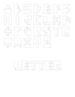
Folded Paper Alphabets
Using 26 letter-sized sheets of white paper(Letter and Tabloid) I created a collection of letterforms using as little cuts and folds into the form as possible.


LETTER


TABLOID